Baseline Shift on "pricing" and "units per" Rigging Question
-
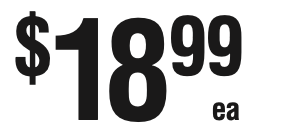
I have a client asking for the “cents” and “Lbs” to be smaller and either matched to the top of the line or the bottom of the line. (See screengrab “99” and “ea”.) I’ve made numerous attempts to attach it to the price and having the 99 be in its own column on the spreadsheet to control the size. But each replication the smaller lettering is not always consistently attached. Feels like there is a similar solution, I’m not seeing. Any suggestions?


-
@turnerryan So this is one of those issues that is very difficult to deal with due to the way that AE’s text tools work, and how it reports the bounding boxes of text layers and individual characters. It also has direct tie to how the individual fonts themselves are built. Some fonts’ characters have little bits that extend beyond the edges of where they “should” be, and the text layer’s bounding box will also be larger or smaller than it should. None of this takes into consideration ascenders and descenders, either, and AE doesn’t sanely deal with these when trying to use tools like ours to calculate the dimensions of those layers. We do our best to make the tools as intuitive as possible, but it’s not always easy with what we can access in AE.
There are options to use other layout engines, either for your entire project (we’ve added an option in the Preferences to disable Templater’s layout engine), or for individual layers. You could look at mamoworld’s Pins and Boxes or Zach Lovatt’s Flex tools as alternative, expressions-based layout engines. There’s also a YouTube channel called Motion Developer and he’s got a variety of “libraries” that he’s built that you can import into your project and use javascript functions in your layer expressions to do very complicated calculations on your own. Here’s a video where he’s dealing with ascenders and descenders to give you an idea of how this works.
Here’s a sample project to doodle with. This is using Templater’s layout logic, but there are some quirks that can get you, depending on the font choices. I’ve set it up so that the cents are anchored to the top right corner, and there’s a faded out (non-rendering) “guide layer” with the “ea” text layer’s anchor point and position parented to that layer, instead of using Templater’s attachment properties. Note that for this to work, the text layer anchors are all (or mostly?) set to be right justified in the paragraph panel. This matters, because it affects where the anchor point of the layer is, but it can also be problematic depending on the way an individual font face is built, as I mentioned previously. There are probably ways to make this layout more bulletproof with some better expressions, but I wanted to get something out quickly.
-
@jon Thanks Jon. I’ll test your idea out today. We’ve tried attaching to nulls linking PreComps and a handful of other ideas with some success but something always goes out of whack.
Never thought about using Pins and Boxes script, that might be the correct route. When a solution works land, I’ll let you know.
Appreciate the quick response and help!!!
Cheers!
-
@Jon Pins and Boxes was the solve! Incredibly simple to rig and every thing was responsive so the length of the price is not an issue. Here’s what I did. Set up the pricing in three text layers; currency sign, Large price and Smaller price. Moved the anchor point of the smaller text to the top left. Added “Pins and Boxes”, Pin to the larger text and parented the smaller text to the “pin” on the larger text top right corner.
Thank you for the suggestions!
-
@turnerryan Glad to hear that worked!